Loading
Loading

One of major issues in Power BI desktop app was its panes, there are multiple panes that had been designed in different times of product development and each had their own UI patterns and backend code.
This made onboarding, learning UI patterns and optimizing or updating them much harder for our users and developers.
Since I joined Power BI team I was trying to solve this huge issue and after many meetings and discussions I finally managed to convince our team that this problem needs to be resolved.
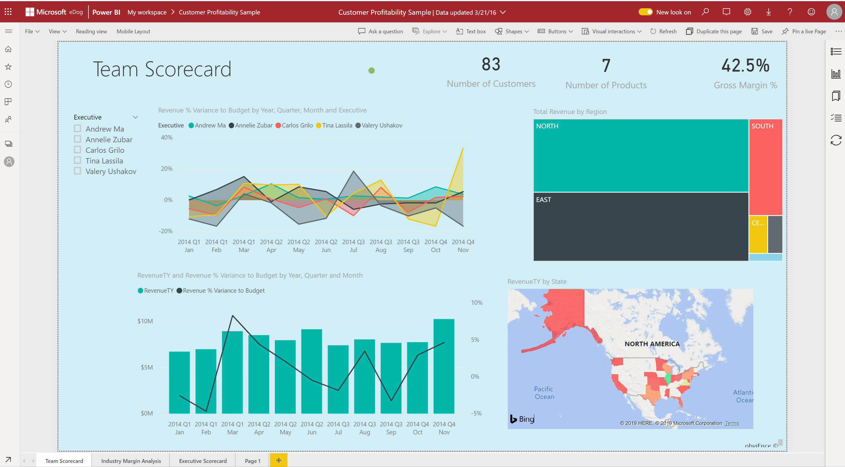
What is Power BI?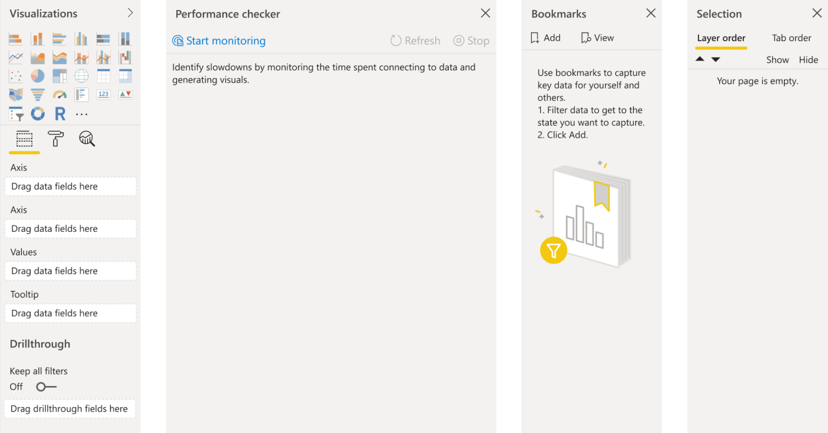
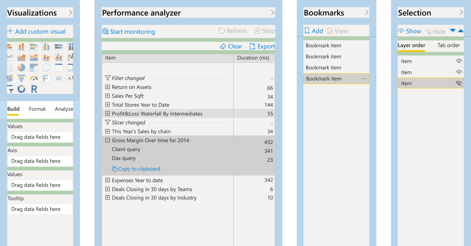
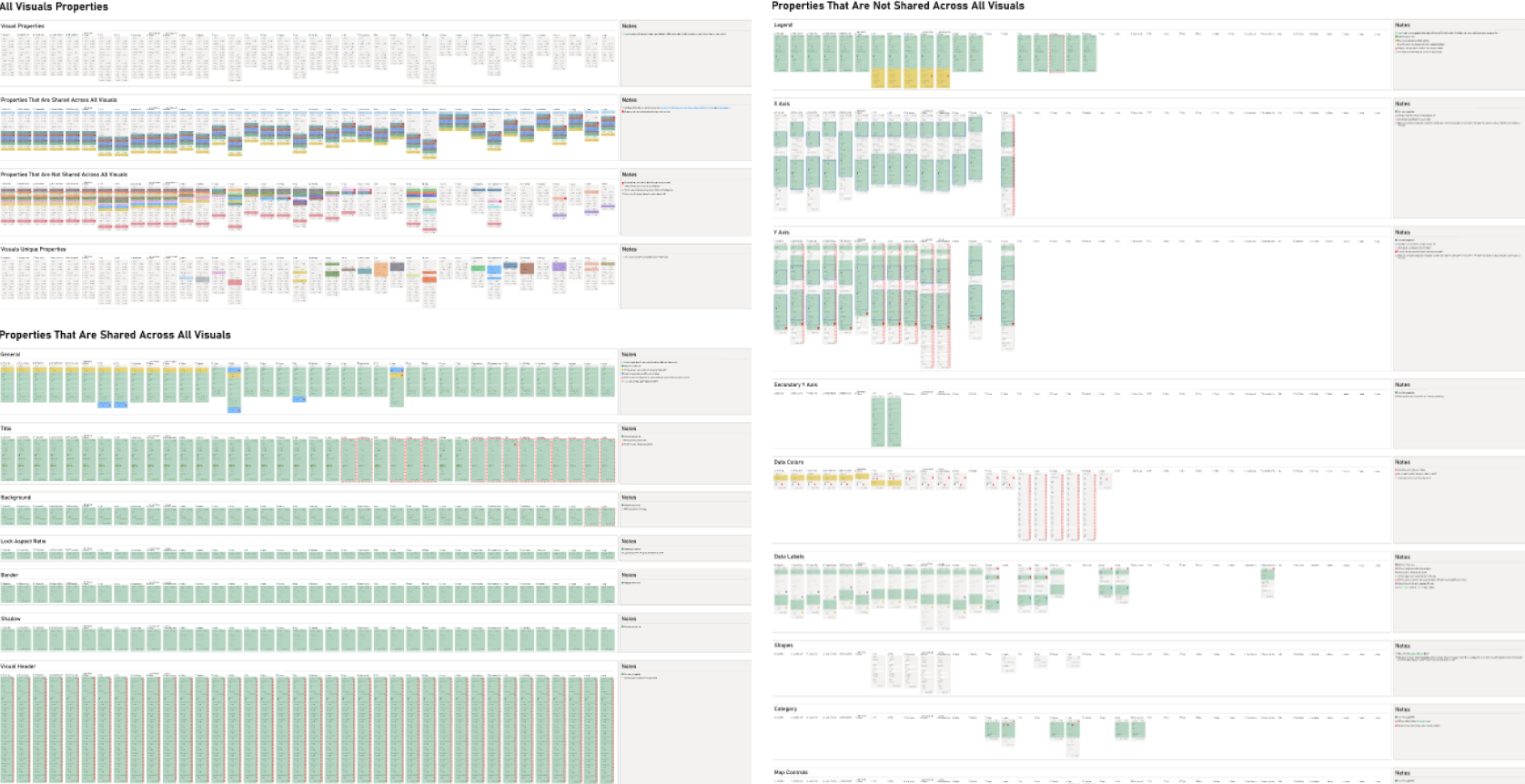
As you can see in this picture each pane has a different functionality in Power BI and there isn't a consistent pattern across any of them.
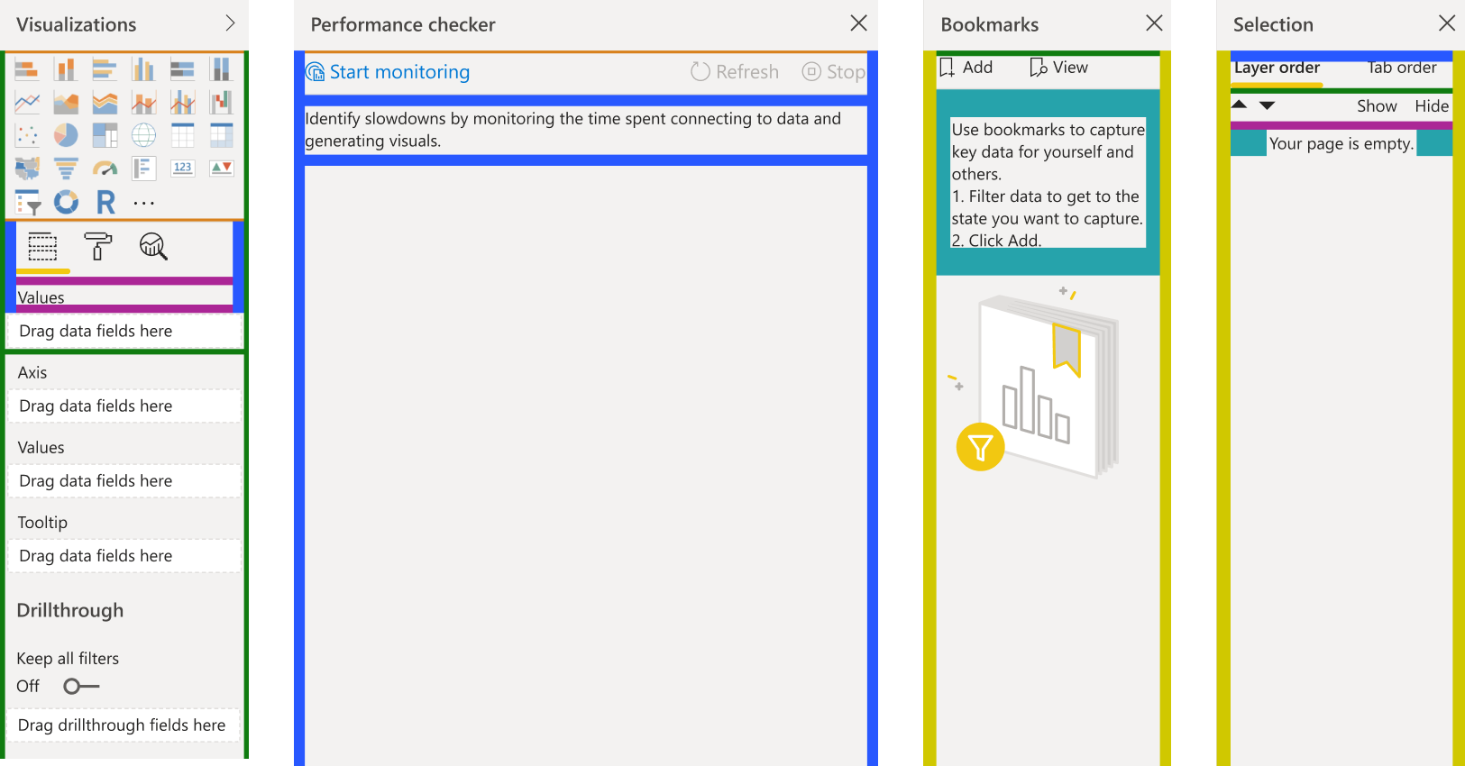
Each color in this image represents a different size padding and margin. As you can see there are lots of styling inconsistency across all panes.
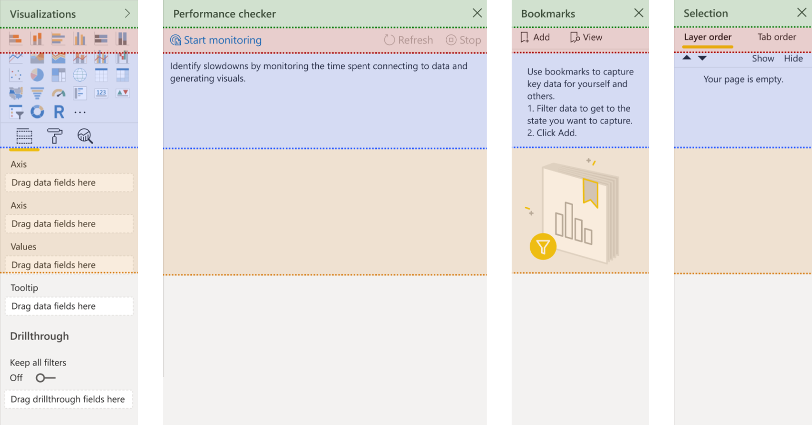
Not only the styles are inconsistent but also the structure of each pane is different, some have action bar, some don't. Some have empty state with a visual and some don't and so on.
This was my initial proposal, I brainstormed this idea with our team to bring all these panes into one cohesive pattern and style. It would help users onboard Power BI easier and make maintaining and updating them much easier. Also future development would benefit from predefined pattern and style.
Although it was almost obvious that we can't tackle every pane in this project but we went trough multiple brainstorming sessions and discussed all possible scenarios and solutions. At the end based on previous user research data and user survey that we did it became clear that formatting pane has a high frequency of issues and user requests for improvement.
The formatting of visuals is a common task for our users and has been known to consume significant amounts of their time due to various issues, including:
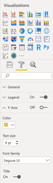
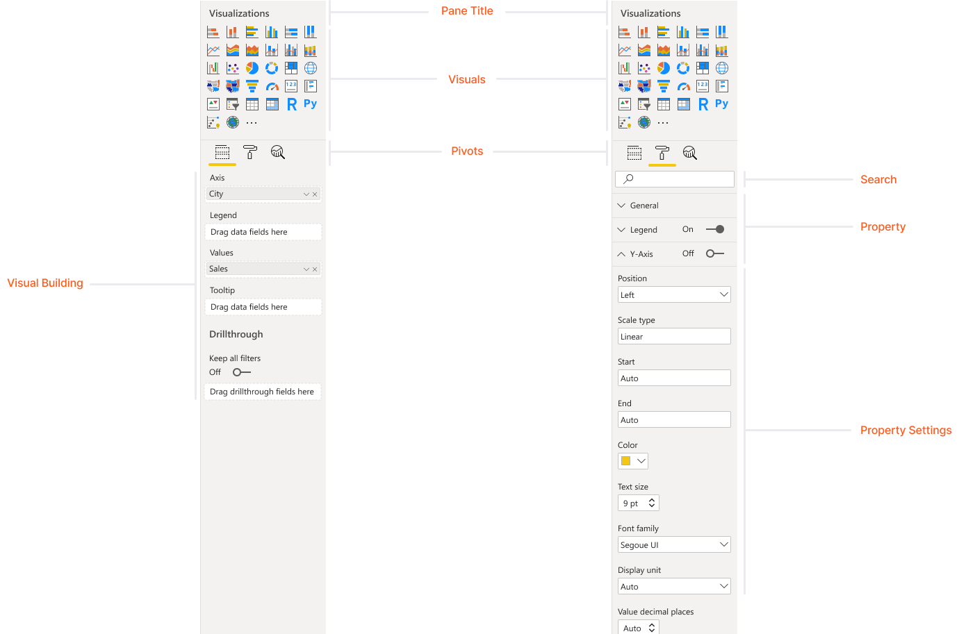
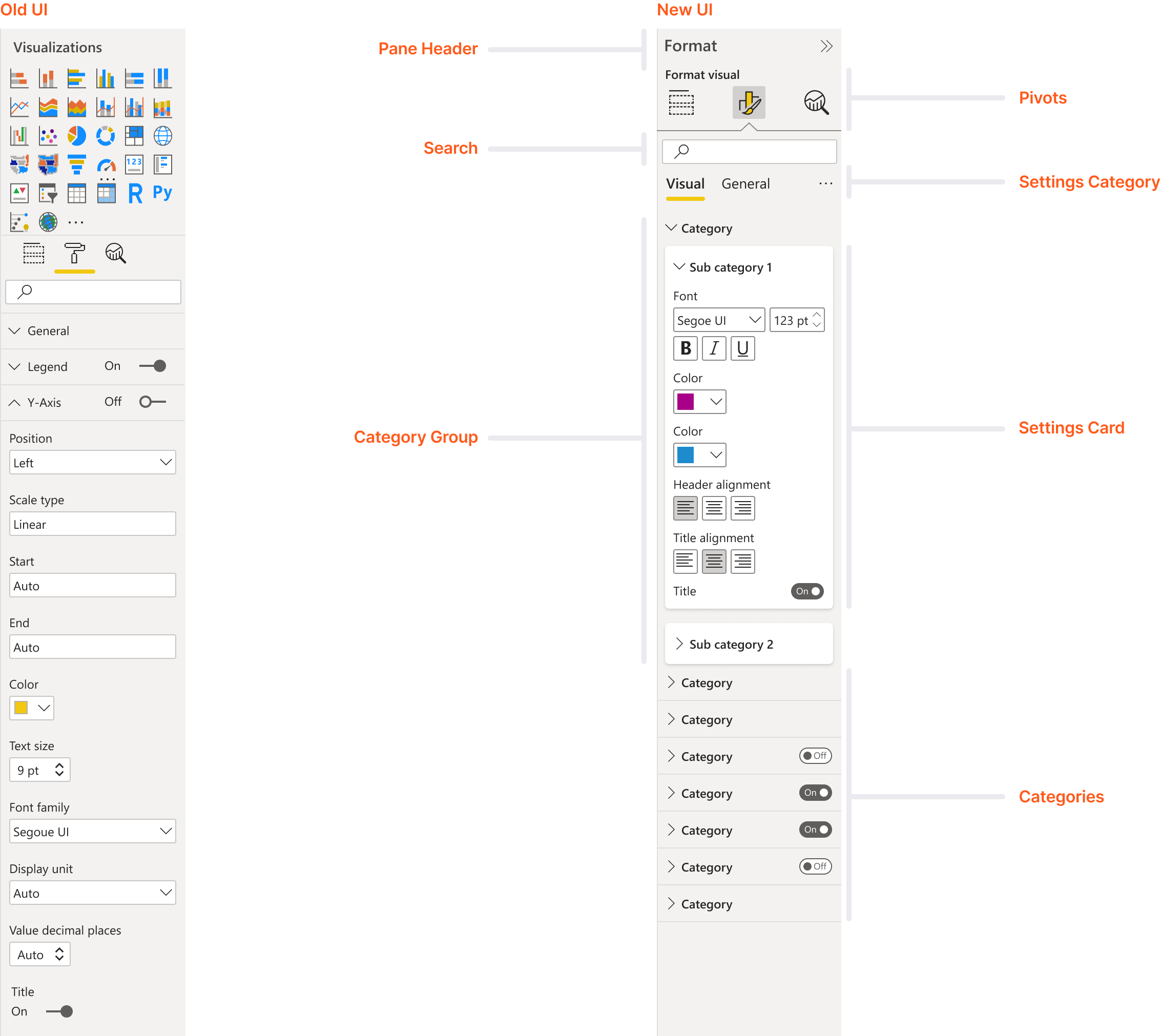
Here is the structure of the formatting pane in Power BI desktop. There is a title, visual selection section, pivots that users can switch between building the visual, formatting the visual and analyze the visual.
Left image is when the build part is selected and right image is when user is in formatting pivot which has search and all properties and settings of selected visual.
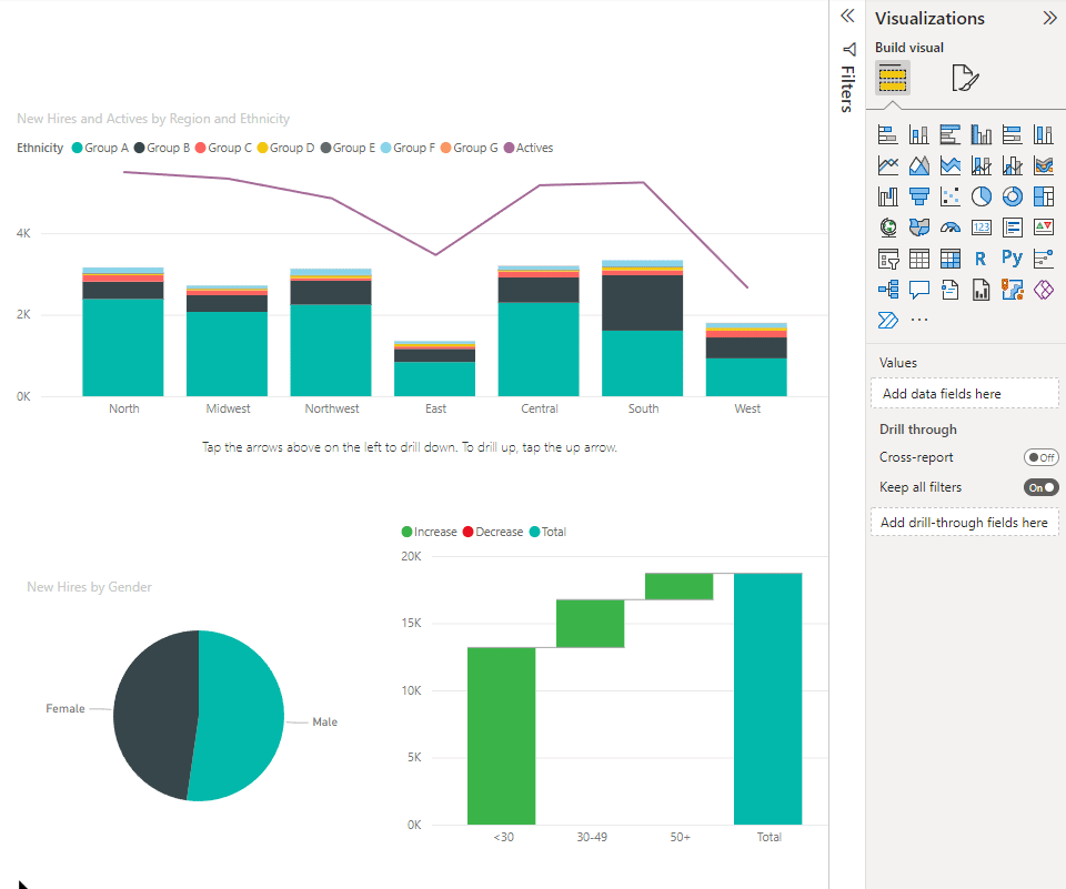
Here is a sample of a basic task that users try to do, changing colors of gridlines in their visual.
First they need to select the visual, then switch to format tab which has tons of formatting options without any order and logic. (Notice the double scrollbars)
They try to find an option for gridlines in a long list of options and they see there is an option for guidelines which is weird because they are gridlines. Then they can switch the color of these lines, it takes about 14 seconds to do this very basic formatting task.

We knew our users spend a lot of time making their reports look good. If we help them reduce this time and make beautiful report faster we will have happier user which in return they can make their reports easier to read for their consumers. Our definition of success was based on these factors:
Alan is a data analyst who is responsible for performing statistical data analysis and delivering insights about their domain to the business.
Their job typically involves: (For this project we only focused on first two tasks)

Along the way we faced many challenges and needed to coordinate with many teams to address these issues as well as our passionate users that as many of you know changing something after couple of years is going to be hard for them.
Here are the list of the teams that I had to work with in order to update this specific part of the Power BI desktop. As you can see there were lots of collaboration between me and all these teams.

By this time, we didn't have any centralized place or document that contained all these different options and settings of formatting in Power BI. My first step was to go over all these settings, categorize and review them to understand what we are dealing with and if there are any other issues that we missed during our initial conversations. By creating a comprehensive catalog of formatting options, I was able to enhance our workflow and ensure consistency in our collaborations.
Visuals
Properties
Settings
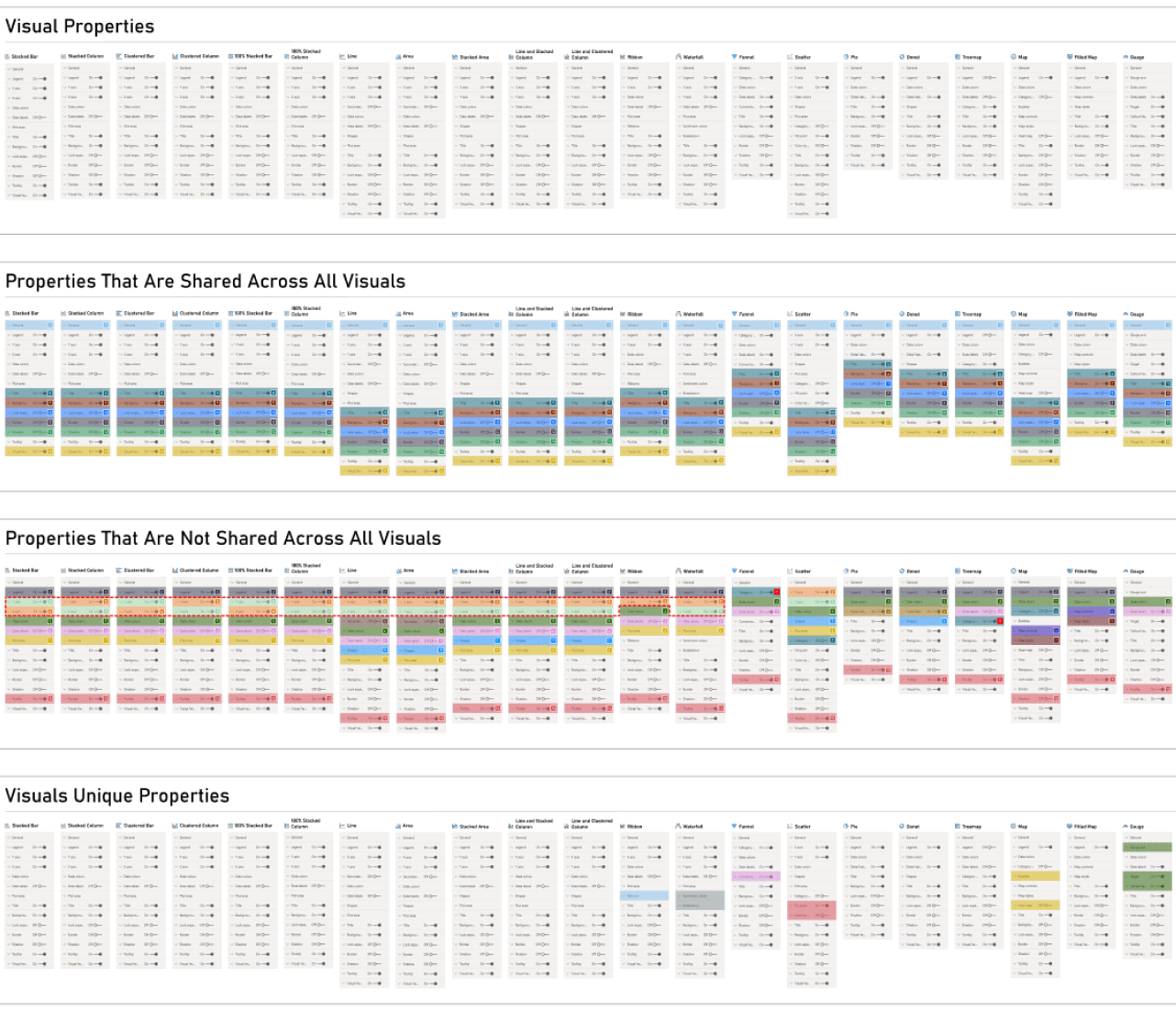
After my initial audit, I noticed that there are more issues that we initially thought there were. It was a huge eye opener for myself and my team to understand what we are dealing with. Here are some of the issues that we didn't know about:
As you can see in this sample image, I grouped all properties into different categories to showcase the issues, inconsistencies in our formatting pane.
As I mentioned before this audit showed us many issues that we missed before. Suddenly all our team members started using this file and contributing to it. Researchers, content designers, product managers and even engineers started using and contributing to this huge file.
We wanted to know how our users format the visuals in their reports, what are the steps that they take to acheive desired formatting, what are their top settings and properties that usually use. We ran a survery and we found these:
Majority of users (94%) mentioned this order:
Many users mentioned getting the data right (steps 1-3) before start formatting visual. This was one the reason for one of the design decisions that I made later.
We also wanted to know how our users try to format their report, what are their top settings and properties that usually use. This chart shows what settings and properties they usually use to format their visuals:
We also asked them what are most pain points that they have during formatting their visuals and these were their answer:
Before beginning the designs, our team established a set of principles to guide our work moving forward.
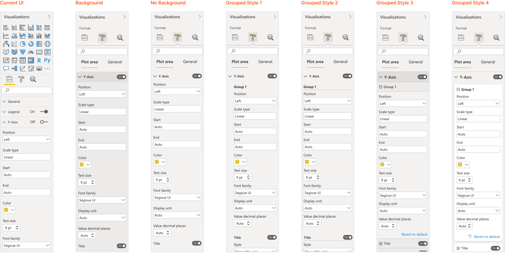
After conducting a user survey, collecting feedback, and performing an audit of the formatting pane, I have developed several potential solutions to address the identified issues.
The main design changes that I aimed to test were:

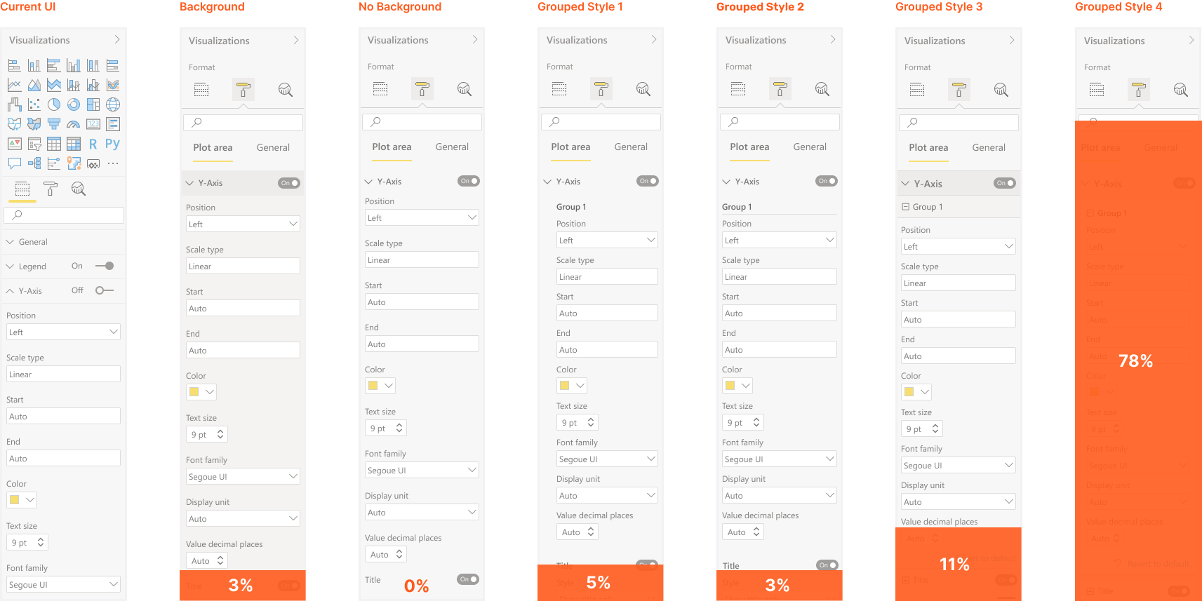
We conducted another round of user research with 20 participants (10 current Power BI users and 10 new users) and asked them which concepts do they prefer. Here are the results:
Here are some of the feedback that we got from this study:
“I like the clear design of the two tabs for formatting. It helps the user narrow down his options in order to determine what he is looking for.”
“It looks cleaner, and I prefer it because it is simply for formatting.”
“This saves time instead of having to look down a long, general list as in the first option, or the drop down of the third option.”
“I feel users might be looking for the chart info and the parameters to be included in the chart, not understanding the dropdown option.”
Once I became confident that the grouped version was the best solution, I began exploring various ways to group properties in our formatting pane. I iterated through multiple options, seeking to find the most efficient and intuitive grouping scheme possible:
To understand user preferences on these concepts, we conducted another round of user research. Based on our findings, here are the results:
After multiple rounds of iteration, research, and collaboration with various team members, we have confirmed a list of changes and guidelines. The following outlines our findings and decisions:
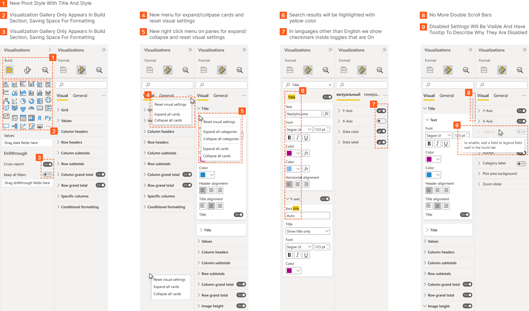
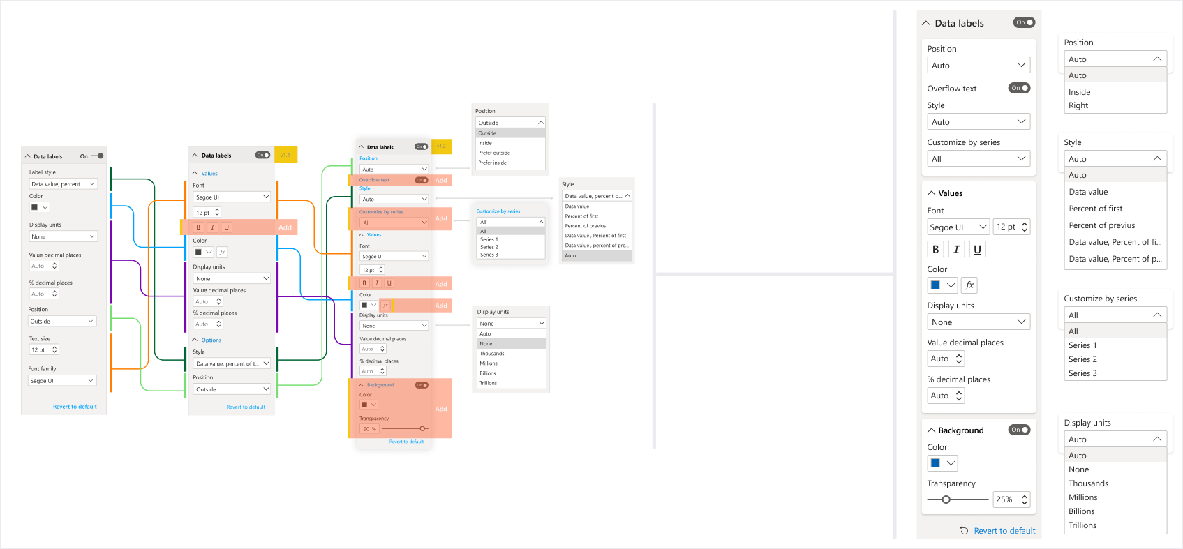
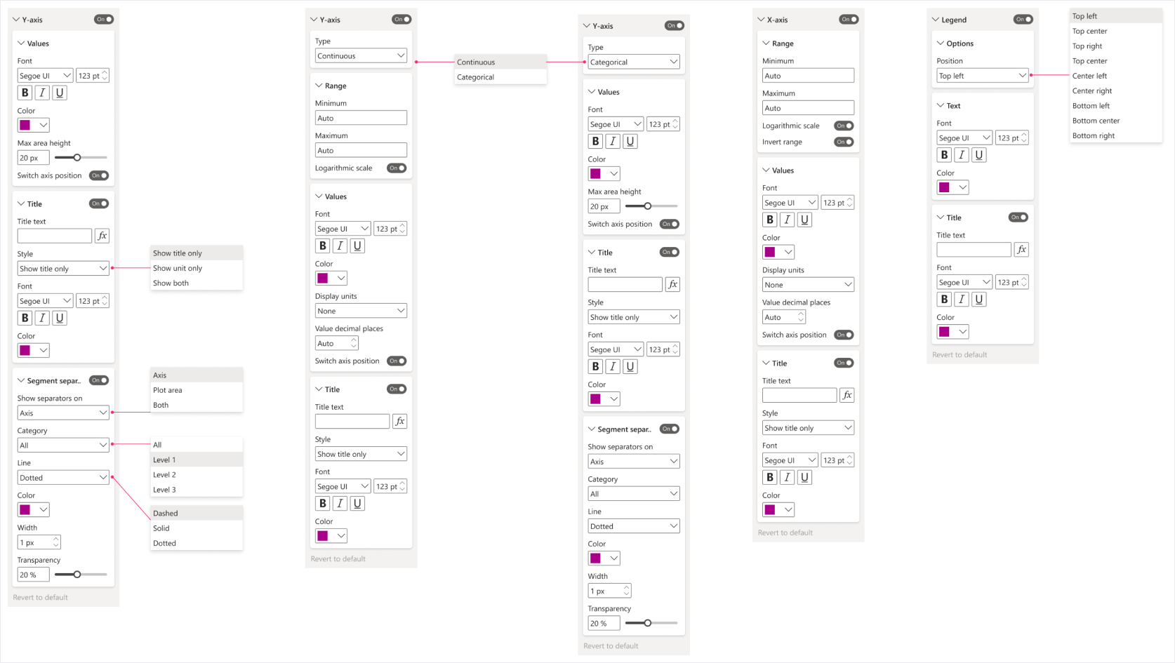
And here is the updated structure of the format pane and you can see what has changed compared to old version:
improvement
I tested couple of different tasks in old and new UI and in some cases I see 50% improvement in finishing those tasks.
Here is a sample of same task that I showed in the beginning of this case study:
Restructured and converted all visual properties and settings based on our guidelines into new design framework with side by side comparison to old UI for engineers to be able to compare to previous version if necessary. It took between 3-4 design iterations for each visual to finallize the new structure and property order.
Created fully dynamic component library in Figma where anyone can start making new settings for any new and upcoming visuals
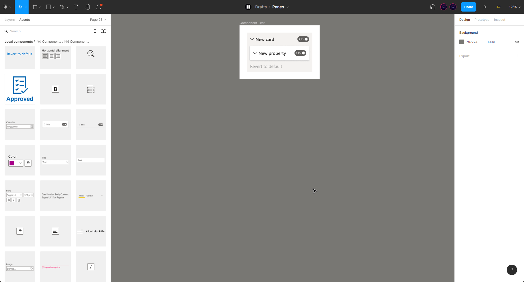
Created a document that contains best practices and guidelines on how use this new framework. Here is a sample snippet of that document:

Created detailed redlines for engineering team with accessibility guidelines, here is a sample snippet of that document:
We wanted to show our users what has changed in formatting pane with a simple intro animation, I collaborated with our animation team to develop a concise yet impactful introduction animation that effectively communicates the key changes to our users.
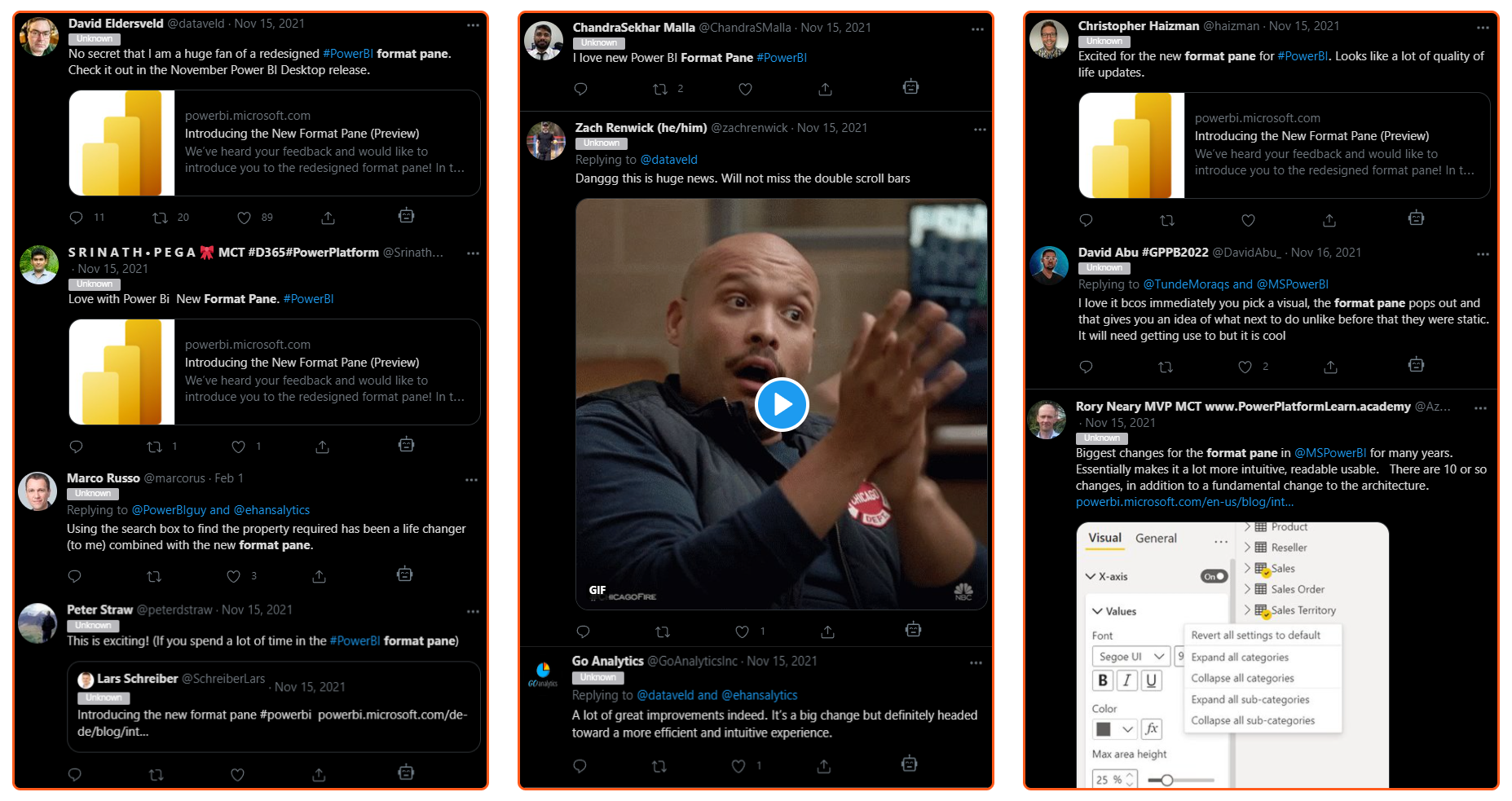
In Power BI Desktop, usually when we release a new feature there is an option to opt-in for early preview of that feature and users can turn it on or off, When we shipped the preview in March, only 2% of people turned it off (some veteran users took a while to adjust to the change). We’ve had more than 30% increase in usage since we launched this re-design publicly in June 2022. Here are some of the users reactions from Twitter:
Our team's significant project efforts have resulted in making numerous user tasks significantly more efficient. However, we're not stopping there. My next objective is to incorporate object formatting capabilities into Power BI desktop.
During a week-long hackathon project at Microsoft, I collaborated with an engineer to create a prototype of my idea. As a result, users will be able to customize pane size, position, and visibility, as well as stack them together to create additional workspace if necessary.